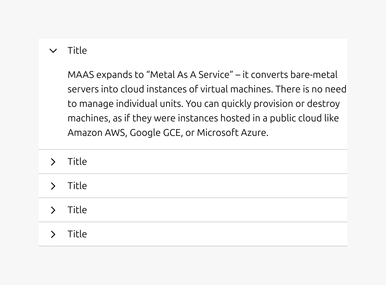
Accordion
The accordion is a vertically stacked content area which can be collapsed and expanded to reveal or hide its contents. An accordion can be opened or closed independently of its surrounding counterparts (i.e: multiple accordions can be open at the same time).
When used right, accordions can help browse different pieces of related content in a more efficient way. Be wary that they can also hide content from users and are not suitable when a user is meant to read all of the page content.
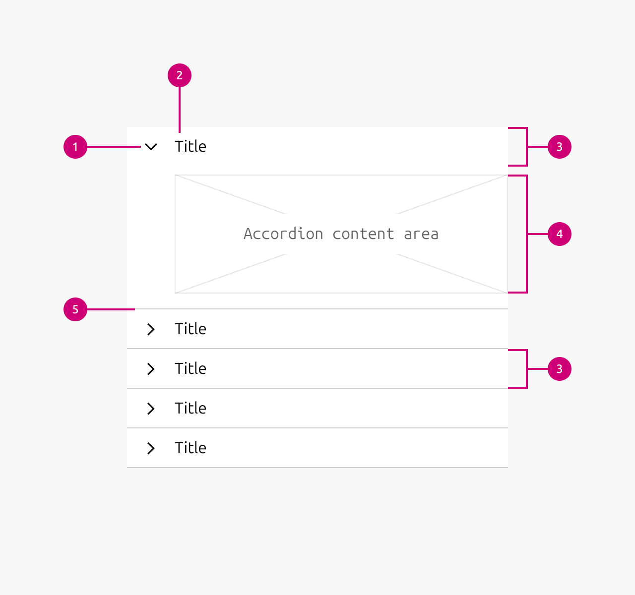
Anatomy
Usage
The accordion can be used to pack a lot of content into a constrained space by allowing to collapse and expand the accordion item to show or hide its contents. It also allows the user to consume the contents at their own pace and preference by not immediately showing but relying on progressive disclosure instead.
Therefore when used right, accordions can help browse different pieces of related content in a more efficient way. Be wary that they can also hide content from users and are not suitable when a user is meant to read all of the page content.
Heading
The heading of the accordion should give the user a clear indication of what the contents of accordion item are going to be. The user should not have to open the accordion item to understand what is contained inside of it.
Panel
The panel is what contains the content of an accordion item. Be mindful of what contents are put in the accordion item as an accordion does not lend itself well to containing overly complex components or patterns. The contents of an accordion will most often be just plain text or a simple component arrangement like filters (checkbox + label).
It is not allowed to nest component items.
When to use
- In cases where there is a lot more content than the available screen estate allows for. E.g. when there is a lot of filters to show in a sidebar.
- When you want to allow the user to scan large amounts of contents in a smaller amount of space and dive deeper at their own choosing. E.g. in an FAQ.
- To shorten page lengths (an scroll time) if it is not important that the user reads everything.
When not to use
- It’s not recommended to use accordions when the page content must be seen at a glance by a user.
-
- Instead you might consider restructuring your content or using anchor links in the beginning of the page which redirect the user to specific sections of the page.
- If the data you want to show is inherently nested as navigation items do not allow to be nested.
Examples
Properties
| Name | Type | Required | Description | Constraint | Options | Default option |
|---|---|---|---|---|---|---|
| Content | slot | Yes | The content property sets the content that is being shown in the panel of the accordion. The content can be set to any content that the designer / developer wants to show. It is not allowed to nest accordions in the content section. By default the content section contains just a text element. | - | - | - |
| State | single select | No | The state property controls the current user interaction state of an accordion item. | - | default, hover, active | default |
| Heading style | single select | No | The heading style property changes the styling of the heading of an accordion item. | - | default, h1, h2, h3, h4, h5, h6 | default |
| Heading | string | Yes | The heading property controls the text content of the accordion item heading and can be freely set by the designer / developer. | - | - | - |
| Expanded | boolean | No | The expanded property controls wether an accordion item is opened or closed. | - | true, false | - |
Change log
| Who | When | What |
|---|---|---|
| Maximilian Blazek | 21.11.2025 | Test the change log table |
| Daniel Mutis | 21.11.2025 | Initial commit |